Skip to content

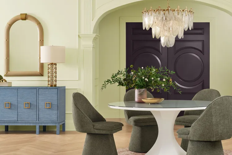
Meet Celery.

Sherwin-Williams and its sister brand HGTV Home by Sherwin-Williams have picked a fresh, bright, yet calming hue as their Color of the Year.
The two brands have teamed up again this year to reveal a joint 2027 Color of the Year—Celery. The entire HGTV Home by Sherwin-Williams product line, including interior, exterior, and cabinet and furniture paints, can be tinted to Celery and is available exclusively at Lowe’s stores nationwide and online. (It’s paint color Celery SW 6421 at Sherwin-Williams and Celery HGSW6421 at Lowe’s.)

“Celery was chosen as the 2027 Color of the Year because it reflects today’s priorities: wellness, balance, and connection,” said Ashley Banbury, color marketing manager at Sherwin-Williams. “Homeowners and designers are increasingly prioritizing wellness at home, seeking soothing environments that support mental health and overall well-being. This shift has also fueled interest in eco-inspired design, with a greater emphasis on bringing elements of the natural world indoors through color, while a sustainability mindset is shaping preferences for hues that feel enduring,” said Banbury.
The hue is rooted in themes of creating everyday balance at home, a sense of “lived-in” beauty, and shared moments. According to the release, the collection pairs Celery with a mix of soft neutrals, grounded earth tones, nature-inspired greens, expressive accents, and sophisticated jewel tones.

“Celery is a soft, fresh yellow green with subtle warmth that brings a calming yet uplifting presence to any space,” said Banbury. She also noted that one of her favorite places for the shade Celery is in a bedroom. Due to its fresh, nature-inspired quality, Celery helps bring the feeling of the outdoors in, creating a space that feels restorative and calming without being sleepy or muted.
“There’s something especially appealing about waking up surrounded by a soft green like Celery—it’s refreshing and optimistic, helping set a gentle tone for both starting and ending the day,” she adds.
Celery pairs beautifully with White Flour (SW 7102), Potentially Purple (SW 6821), Cosmos (SW 6528), Georgian Bay (SW 6509), Artichoke (SW 6179), Cocoon (SW 6173), Woven Wicker (SW 9104), Kirsch Red (SW 6313), and Plum Brown (SW 6272).
“It shines as part of a thoughtfully curated palette of rich, grounding hues designed to layer depth and dimension. Tones like Kirsch Red and Plum Brown introduce bold warmth and sophistication, while accents such as Potentially Purple and Cosmos add a refined softness and quiet elegance,” said Banbury. “Deeper shades like Georgian Bay, Artichoke and Cocoon create contrast and anchor the palette, while Woven Wicker and White Flour provide light, breathable neutrals that keep the look approachable. The result is a palette that feels balanced, restorative and effortlessly elevated, perfect for creating spaces rooted in comfort, connection and modern sophistication.”