Skip to content

18 Kitchens With Sage Green Cabinets That Prove This Calming Color Works With Almost Any Style
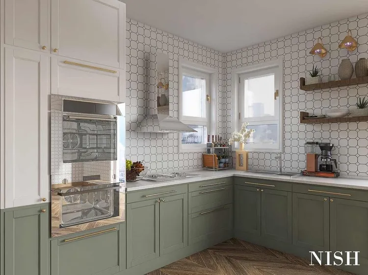
Sage green cabinets brighten up kitchens, bringing a cheerful and welcoming feel to any cooking space. This popular shade pairs well with different hardware styles and design accents, offering great versatility whether you’re creating a new kitchen or updating old cabinetry. Dive into 18 beautiful kitchen designs with sage green cabinets that could inspire your next home makeover. 01of 18 Two-Toned Delight Classic white + sage green = the best of both worlds. This two-toned setup is modern and eye-catching. A geometric backsplash adds even more oomph to this fabulous kitchen. 02of 18 Serene Space A light sage pairs wonderfully with white accents in this charming yet subdued kitchen. Given how much time you spend prepping meals, cleaning, and performing general household tasks in the kitchen, it’s certainly a worthwhile pairing of colors to keep your space calming and serene. 03of 18 Lower Level This kitchen is free of upper cabinets, while the lower ones are coated in a lovely sage hue. Getting rid of upper cabinets for open shelving can be a great way to make a small kitchen feel more airy and spacious. 04of 18 Quality Quartz In this sage green kitchen, quartz countertops pair wonderfully with the muted green shade. By keeping countertop clutter to a minimum, you’ll be able to enjoy the beauty of this luxe finish. 05of 18 Green Galore Sage green cabinets aren’t the only green thing in this sunny kitchen—there are vines, plants, and flowers galore, too. Use green as a starting point to introduce natural touches like these into your own space. 06of 18 Rustic Touch Wood countertops also look gorgeous paired with sage green cabinetry for a more rustic look. If you love farmhouse or cottage style, this may be the look for you. 07of 18 Cool Contrast A small section of cabinets in this kitchen makes for the ideal tea or coffee bar. Sage green once again shines in this space, and deep black hardware pops against the muted shade. 08of 18 Sleek Pulls Cabinet hardware may seem like a small detail but it can add so much personality to a kitchen. These contemporary gold pulls are sleek and sophisticated while still large enough to easily grab onto while running around prepping meals. 09of 18 Bit by Bit If you’re just beginning to experiment with a new color and are unsure how much you’d like to introduce it into your kitchen, start with just the upper or lower cabinetry. Here, the bottom cabinets in this kitchen are painted sage green, and they look ultra charming alongside the white upper cabinets. 10of 18 Nice and Bright Sage green cabinets look right at home in this bright kitchen with massive skylights. Sage green is a great way to keep a space looking nice and fresh while still veering away from plain white, if you find that color to be too stark for your taste. Once again, opting out of upper cabinetry also makes a space feel more expansive. 11of 18 A Little Camouflage This kitchen features sage green from floor to ceiling! If your space is ultra-mod and features a sleek fridge/freezer combo stored behind a cabinet-like front, you can even paint those doors for a fully uniform look. 12of 18 Pretty Pairing Green cabinets and a green wall make for a happy pair. Note that sage looks stunning with other colors within the green family, so don’t be afraid to pair it with deeper shades in other parts of the kitchen, as this space shows. 13of 18 Crafty Ideas Get crafty with your open shelving; note that it doesn’t have to be displayed in a straight line. These curved shelves offer even more storage and could even be painted in the same green hue as the cabinets for even more sage fun. 14of 18 All the Way Up The tops of your cabinets provide valuable storage. If you’re in a small space or just need a little more room for miscellaneous kitchen items that don’t fit behind doors, don’t be afraid to go this route! Bonus points if you display items that complement your sage green cabinetry. 15of 18 Cute and Classic Sometimes simple is best! Minimalistic brass knobs shine on these sage-green kitchen cabinets. And it’s no surprise: Green and gold is always a magical, foolproof combo, after all. 16of 18 Keep the Party Going If you love sage green in the kitchen, don’t be afraid to use it again in an accompanying hallway. As we see here, the more of the hue, the merrier. 17of 18 Play Off Your Floor If your kitchen floor has a fun geometric tiled pattern, choose a cabinet color that will play nicely with the existing hues down below. 18of 18 Or Pick Complementary Wallpaper These sage green cabinets look delightful paired with a peppy wallpaper print. Your kitchen should be a place you enjoy spending time in day in and day out, so if that means introducing some bold patterns that will make you smile, by all means, go for it. You can easily achieve this look in a rental by opting for removable, peel-and-stick wallpaper. What colors pair well with sage green in the kitchen? The best color palette for a sage green kitchen depends on the overall design style you’re going for in the space. For a light, bright farmhouse kitchen, choose white or ivory. A more modern, midcentury-inspired kitchen could pair warm, natural wood tones with sage green. Meanwhile, a moodier or vintage-inspired kitchen might pair navy, darker green, or warm tones like rust or brown with sage green. Which countertops are best for a sage green kitchen? A classic choice would be a stone or quartz countertop in a sage green kitchen. White stone or gray marble with light veining is timeless, black soapstone can have a modern aesthetic. For a more affordable option, the natural wood tones of butcher block beautifully complement a sage green kitchen. Read More: Was this page helpful?